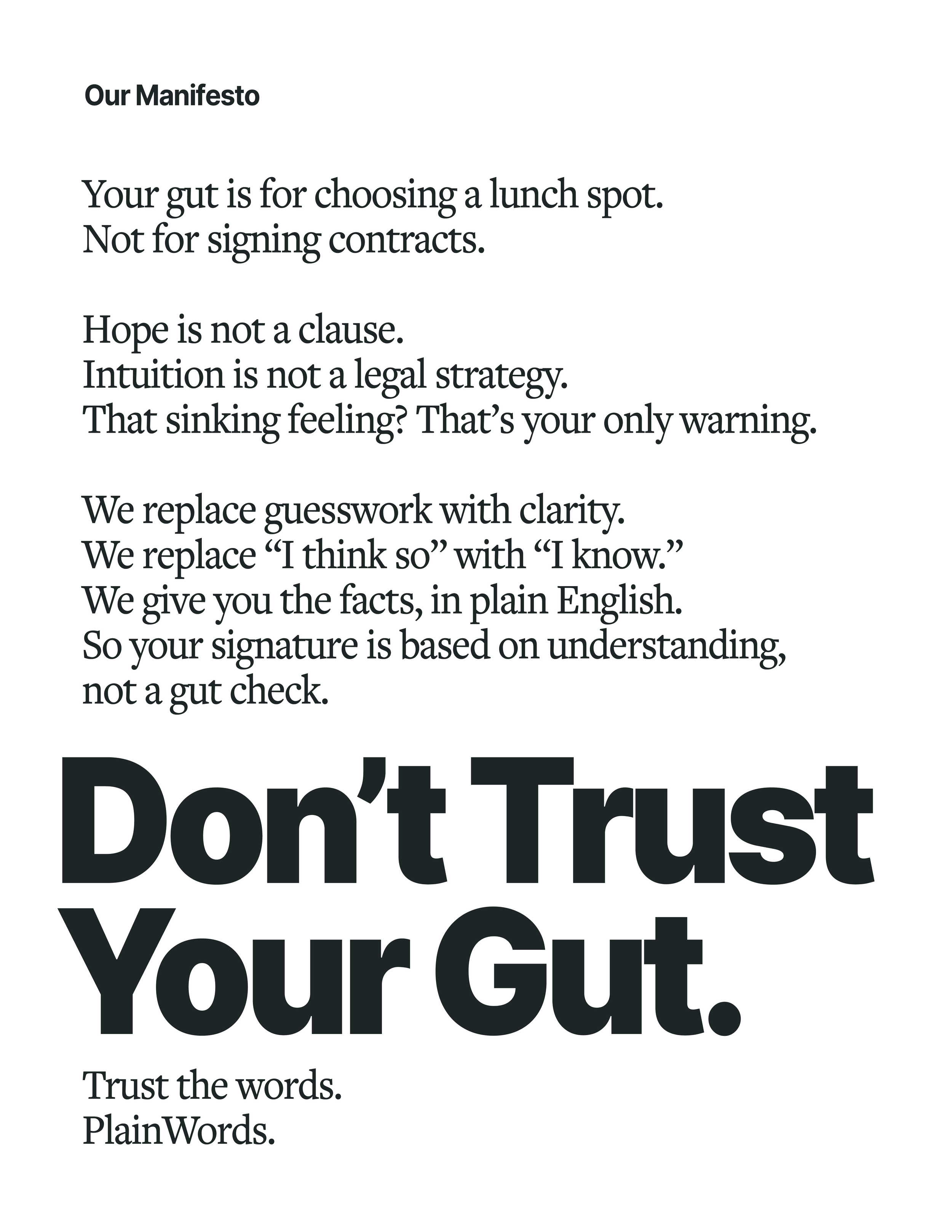
Your intuition is for choosing a lunch spot, not a liability clause. That feeling of “it’s probably fine” is the riskiest part of any agreement.
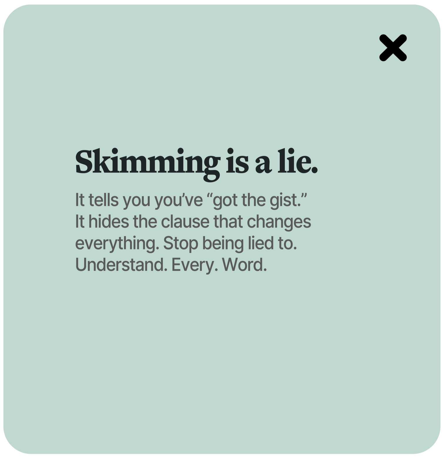
PlainWords™ replaces that gut check with cold, hard clarity. It cuts through the pressure to skim, instantly translating legal jargon into plain, undeniable truth.
Because hope isn't a strategy—and you deserve to see the trap before it snaps shut.
PlainWords™ — Don’t Trust Your Gut.
PlainWords operates on a simple, brutal truth: hope is not a strategy. Your gut feeling is legally worthless, and a "good vibe" won't protect you from a bad clause. Our identity acts as a reality check—direct, unambiguous, and free of the false comfort that leads to costly mistakes. This stands in direct opposition to the willful obscurity of traditional legal documents. Every choice reflects our guiding principle: ‘Clarity Over Hope.’
Strategy
The visual identity is built to eliminate doubt. A clean, sturdy logotype conveys immovable truth. The palette is clear and high-contrast, using accessible colors and generous whitespace to make misreading impossible. Typography is weaponized for comprehension, mirroring the unambiguous language we champion. This is design that exposes, not obscures—turning the most daunting contract into a simple set of facts.
Don't trust your gut. Trust the words.